In the vast hellscape of AI-generated web apps, there exists endless gradients, bulleted emojis, “Modern, minimal, clean looks”, and oceans of pill buttons with drop-shadows. There’s nothing wrong with this look — in fact it’s very clean and readable. Just like our favorite dining establishments, each one built is becoming a boxy, modern, minimalistic copy paste of the previous.
I’ll be diving into the harness I created and used to inject creativity, originality, and a coherent theme into my website that will be used to sell my custom sample packs to musicians, composers, and sound designers — and I’ll go over some interesting takeaways from the process and how you can use this in your agentic workflow.
Why most workflows produce generic results
LLM’s are primed to be efficient, which also means they will take the least amount of steps/work to produce the desired result. If you’re trying to make an entire website or design system, it will default to a lot of proven and effective design decisions (so every AI generated app looks the same). If you try to prompt your LLM to be creative and take liberties in those decisions — and as the context window grows — the LLM will often lose focus and result in an incoherent and lobotomized design system that just doesn’t look good.
Another issue is that the AI has no fundamental understanding of what is ‘creative’ or ‘original’ — LLMs are pretty good at evaluation, yet how does one strictly evaluate verifiable creativity? There needs to be an explicit system that defines the criteria for creativity, and without that, LLMs will struggle to produce solid, usable, creative results.
Methods like Anthropic’s frontend design skill attempt to aid the issue of generic-looking AI frontends, but even though it explicity states to NEVER use generic AI-generated aesthetics, anyone that has used it knows their LLM still outputs very generic-looking designs.
So if regular prompting and skills like this exist and we still get generic AI slop output, how can we really improve our frontend’s design with AI?
Harnessing the power of a design harness
The approach I took involves a long-running, multi-agent process centered around (mostly) autonomous workflows. The specific implementation utilizes a Generative Adversarial Network loop with 3 separate agents: a planner, generator, and evaluator.
| Agent | Role | Tools |
|---|---|---|
design-planner | Senior product designer. Audits the codebase, walks the live app with Playwright, picks ONE bold aesthetic direction, writes design-state/spec.md. | Read, Glob, Grep, Bash, Write, playwright |
design-generator | Senior frontend engineer. Reads spec + prior critique. Opens with “refine” or “pivot” declaration. Stays in scope. Commits per iteration. | |
design-evaluator | Skeptical senior reviewer. Bias toward criticism. Walks the live route on desktop + mobile, scores 1–10 on four criteria, writes machine-readable JSON. | Read, Write, Glob, Grep, Bash, playwright |
The planner would create a design spec broken into isolated sprints, with each sprint comprised of generator/evaluator loops with a max iteration set beforehand.
The evaluator was given a weighted rubric that would result in a pass/fail threshold that I manually set (7.5/10 weighted) and looked like this:
weighted = 0.35 * design_quality
         + 0.35 * originality
         + 0.15 * craft
         + 0.15 * functionality

PASS: weighted >= 7.5 AND every criterion >= 6
Emphasizing the design quality and originality was extremely important because AI generally attempts to play it safe most of the time, and most LLM’s are already very capable of producing UI’s with decent craft and functionality. Also note that the evaluator was specifically told to be skeptical and have a bias toward criticism — this will be important for later.
I used few-shot examples with scores in order for the LLM to gauge design quality and creativity against verifiable criteria to enhance the scoring stability and align it closer to my preferences.
Implementing it
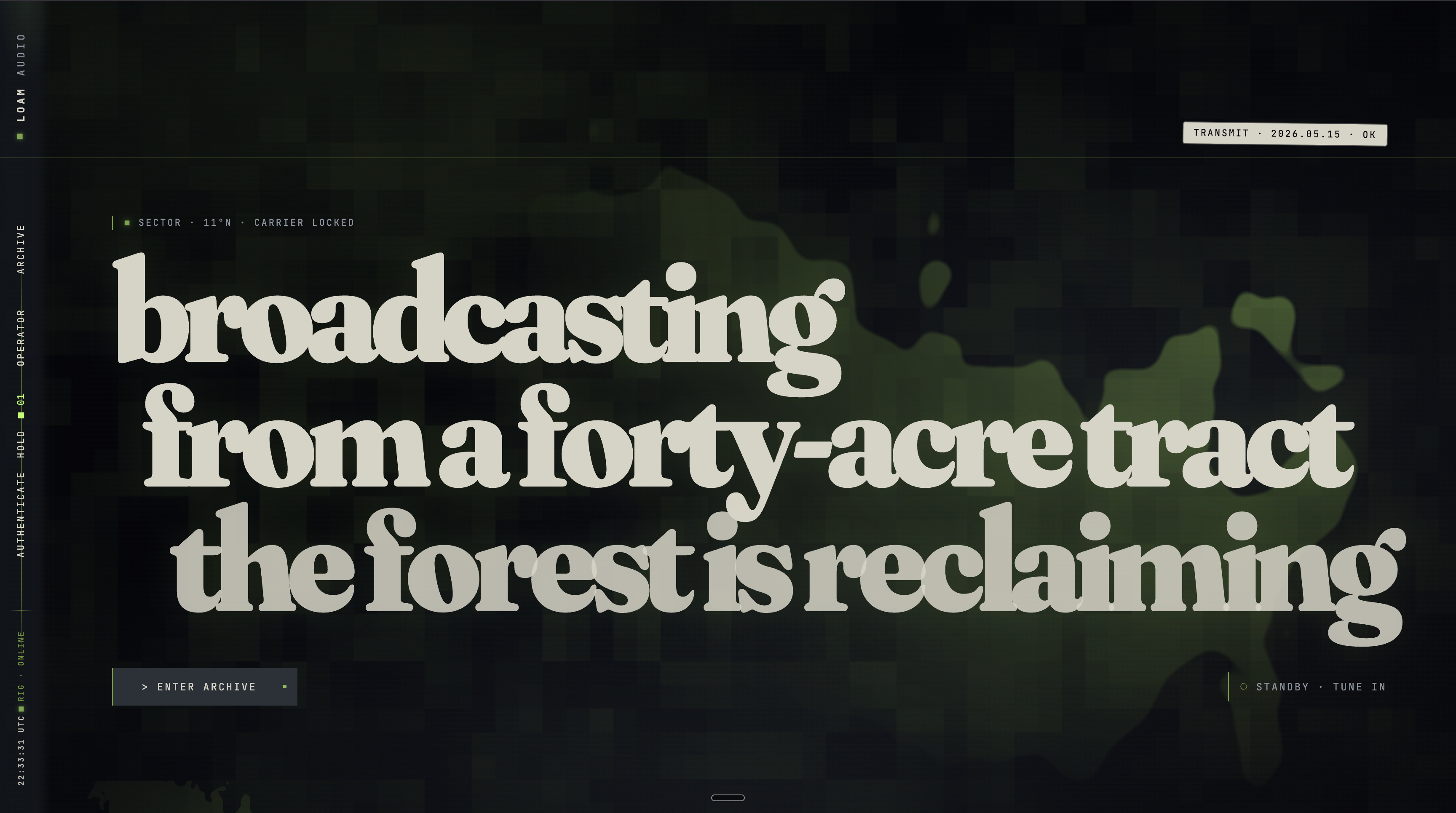
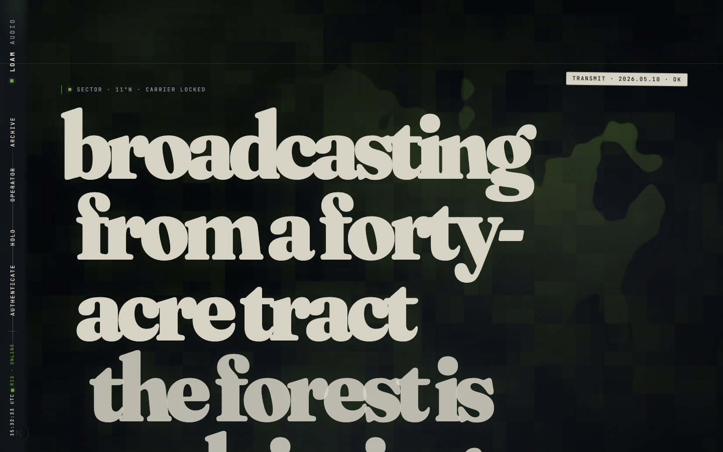
Going back to my soundpack app — the design was decent for an initial build, and had a light thematic element with a typical clean look and solid functionality.
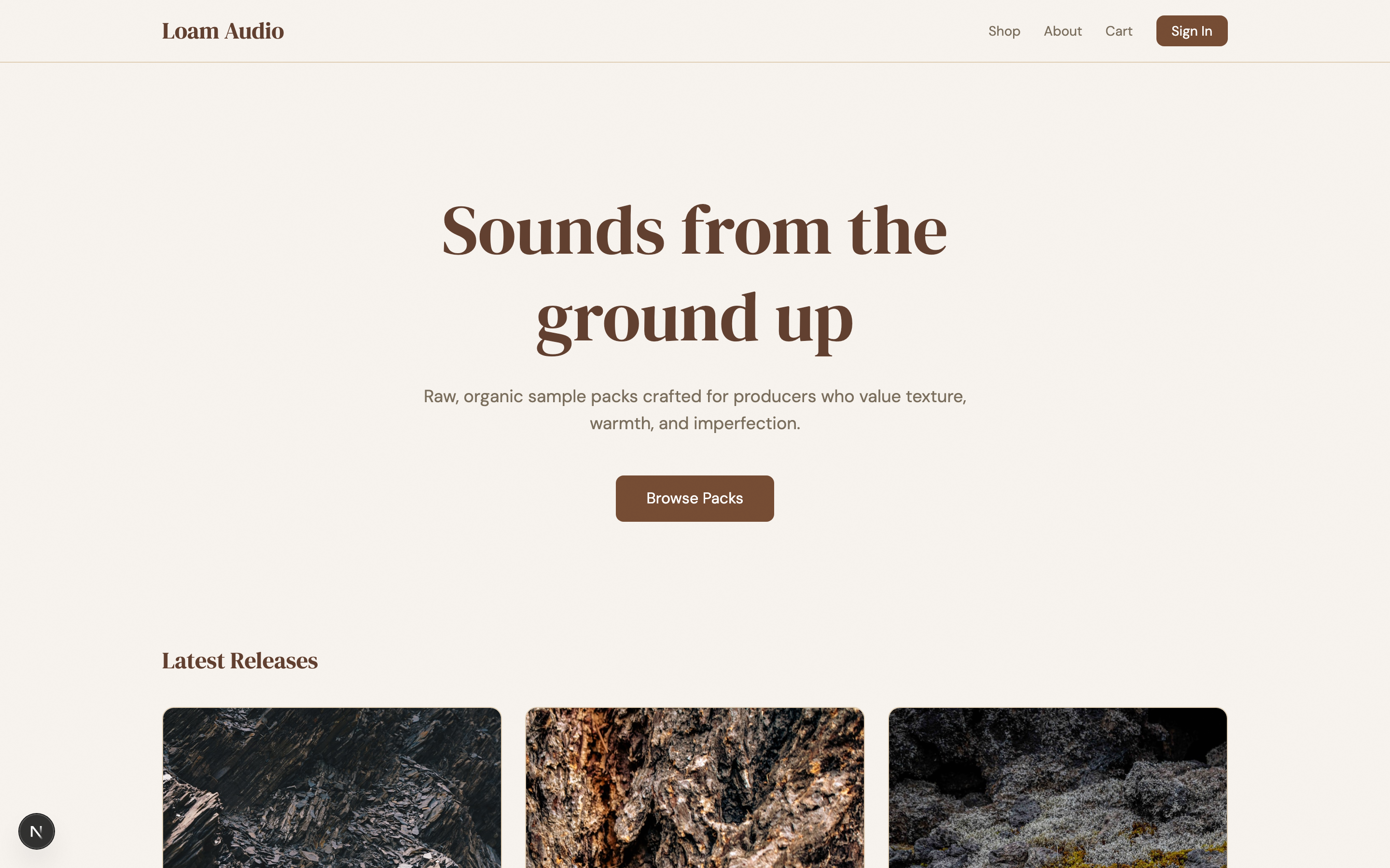
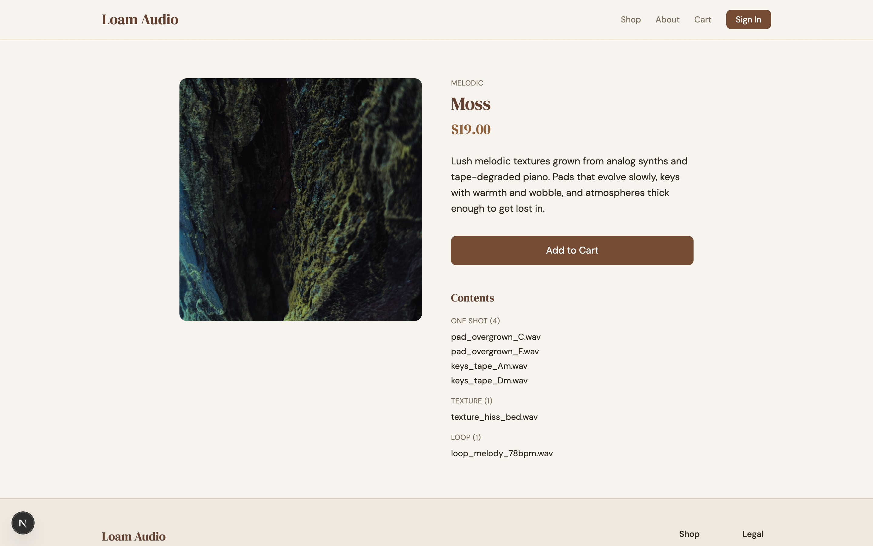
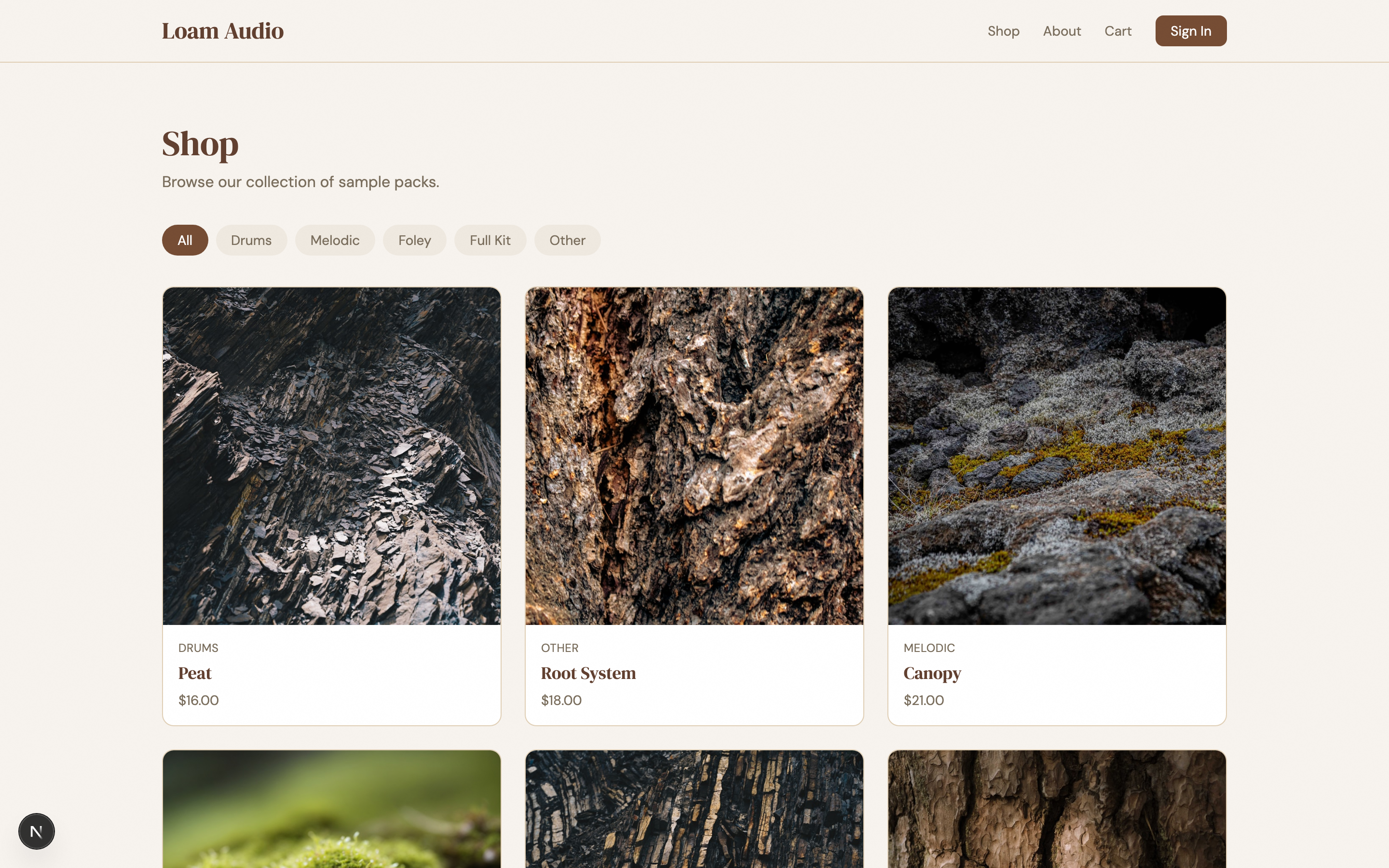
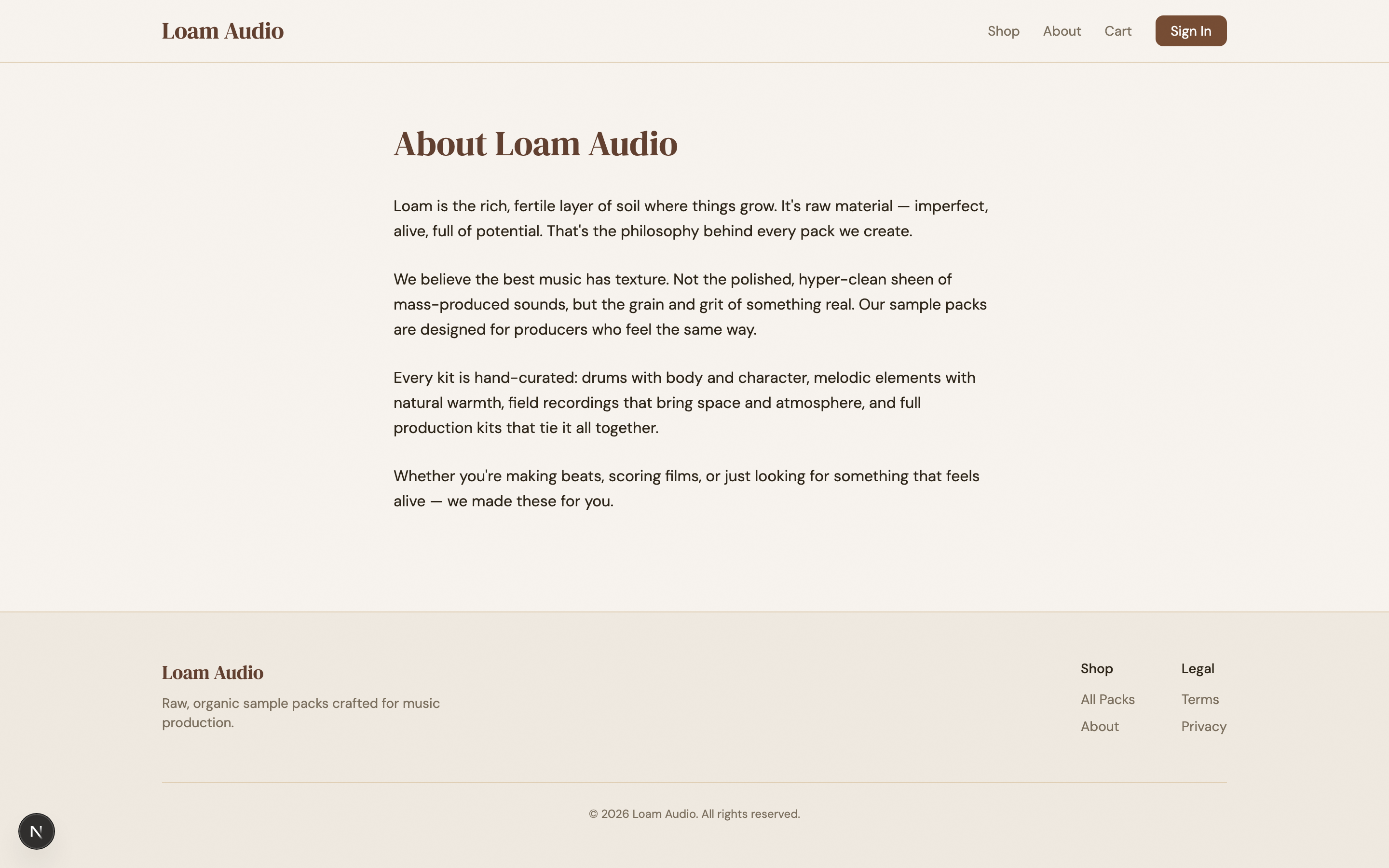
I wanted something that would look like it belongs in the world of The Last of Us (play the games if you haven’t). The prompt I gave the harness planner was “haunting, futuristic, post-apocalyptic PNW, with organic overgrowth eating the equipment”. It ended up breaking up the design into 10 sprints with these results:
| # | Sprint | Iters | Score | Notable |
|---|---|---|---|---|
| 1 | Install Overgrowth Protocol foundation | 5 | 8.30 | The most iterations — installing the world |
| 2 | Shell: nav + footer as field-station chrome | 2 | 7.78 | Left vertical status rail with live timestamp |
| 3 | Home: broadcast hero + transmission grid | 4 | 7.85 | Wildest swings — see drama bit below |
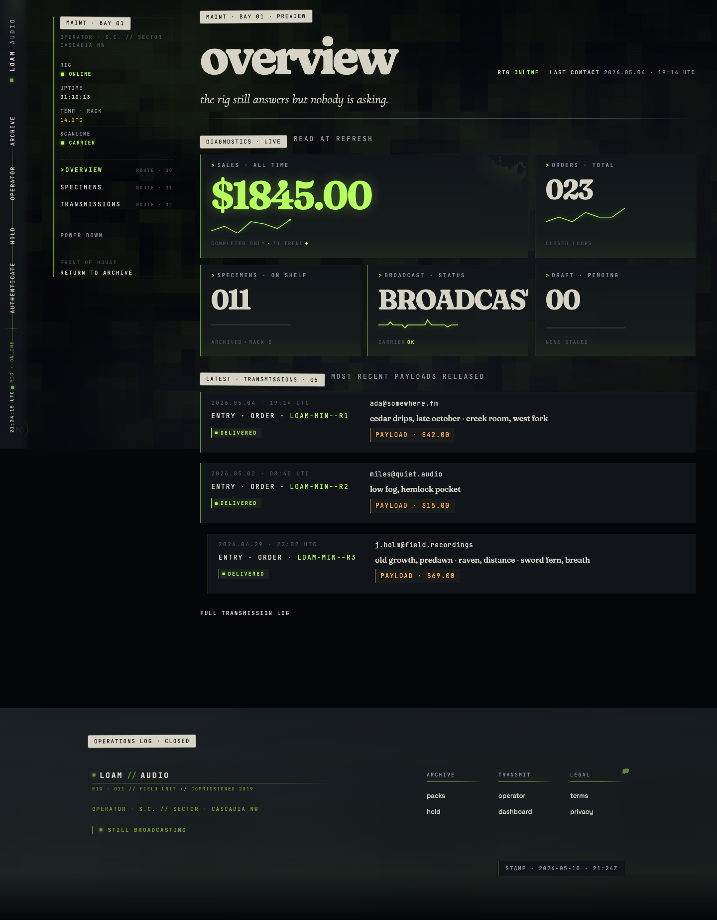
| 4 | Shop: the archive index | 2 | 8.15 | Herbarium where specimens have started growing |
| 5 | Pack detail: the specimen page | 3 | 8.15 | Sodium-amber price as 2nd visual anchor |
| 6 | Cart + checkout: staging payload | 2 | 7.70 | DROP / RELEASE / RETRIEVE language |
| 7 | About: operations log | 2 | 8.00 | Required to feel colder than every other page |
| 8 | Auth: terminal access | 2 | 8.00 | Where dark themes usually snap back to Stripe |
| 9 | Admin surfaces | 2 | 7.85 | ”Built into the wall” — most worn vocabulary |
| 10 | Residue sweep — 404 / 500 / terms / privacy | 1 | 7.85 | Single pass to close |
A couple of the sprints stuck out more than the rest: in sprint 3 iteration 3, the result was disastrous — it scored 3.55 / 10 (down from 7.20 on iter-2). What happened was the generator pivoted hard on iteration 3 — three-layer card stages, procedural drone pad, atmospheric carrier hairline, mono STILL BROADCASTING footer. Looked great in the changes.md narrative, but the hero was invisible in the running build.
The evaluator’s critique opens like this:
The hero is invisible.
.broadcast-hero-slate,.broadcast-hero-h1, and.broadcast-hero-footall carryclass="… reveal"but never receive.revealed. Computedclip-pathis stuck atinset(0px 100% 0px 0px)at 500ms / 1500ms / 2500ms / 3500ms / 8000ms after load, AND after a hard reload + 5s wait, AND after a 1px-up-1px-down scroll jiggle.
This is what the harness exists for. A person reviewing and eyeballing the generator’s PR description probably would have approved it. The evaluator was required to verify by computed style, found the regression in seconds, flagged it, and forced iteration 4 — which recovered to 7.85.

Sprint 9 iteration 1 scored an abysmal 3.45 / 10. This time, the generator wrote ~1,200 lines of admin page CSS (.maint-shell, .maint-spine, .maint-stat-spark, etc.) and shipped the iteration. The Tailwind v4 / Lightning CSS / Turbopack pipeline silently truncated the entire block at a parser bailout. Every admin page rendered in raw block layout. Sparklines inherited full tile width and
appeared as huge angular polylines. Form inputs had no visible borders.
The evaluator caught it via direct curl of the served chunk:
Verified by direct
curlof the chunk (grep -c "maint-shell"→ 0) and by DOM probe — at 1440px viewport,.maint-shellcomputeddisplay: block,grid-template-columns: none;.maint-spinecomputeddisplay: block, width 1376px (it should be 240px sticky).
The fix in iteration 2 was a stylesheet quarantine: split the maint
vocabulary into a sibling stylesheet imported separately so a parse error
in one file can’t truncate the cascade. Plus a CI guard
(scripts/blacklist-scan.mjs) that curls the served chunk and greps
for .maint-shell.
This issue was an interesting anecdote because the bug was invisible to the generator — the source CSS was correct; only the served chunk was broken, so it’s something only the evaluator could have caught.
Takeaways
The goal of this harness was to create a frontend design that was unique, built a cohesive and thematic world, pushed the limits of creativity that current gen AI offers, yet still offered usability and craft.
From a practical perspective, there are things the AI took too far thematically that would be confusing to users of the site — but those things are easily fixable, like the verbiage and terminology used (“Stage Payload” vs “Add to Cart”). I think it achieved far more than what’s capable with just manual prompting. Here’s some of the final stats:
- 10 sprints, all passing the 7.5 weighted threshold
- 23 iterations total (avg 2.3/sprint)
- 2 spectacular regressions caught by the evaluator (sprint 3 iter 3 at 3.55; sprint 9 iter 1 at 3.45)
- 1,134 sprint screenshots + 14 audit screenshots (Playwright, both viewports, every route)
- Highest score: 8.30 (sprint 1, iter 5 — the foundation lock-in)
- Branch:
redesign/overgrowth-protocol, ~50 commits - Total runtime: roughly 30–90 minutes per sprint of subagent work
You can check out the live site here. As of the date of this publication, the site is still a demo with no real sample packs available. Thanks for reading!